About that Productivity Gap

In my post yesterday, I put up this graph, which has been used by many as evidence of major economic problems.

The graph shows a growing gap between the production of an average worker and the compensation they receive for that production. The Economic Policy Institute (which is the source of the graph above), claims that this gap represents a failure of wealth to “trickle down” to workers. The economy is growing, but workers don’t see any of the benefits. I agree that this story, if true, would be deeply concerning. But I’m not so sure it’s true.

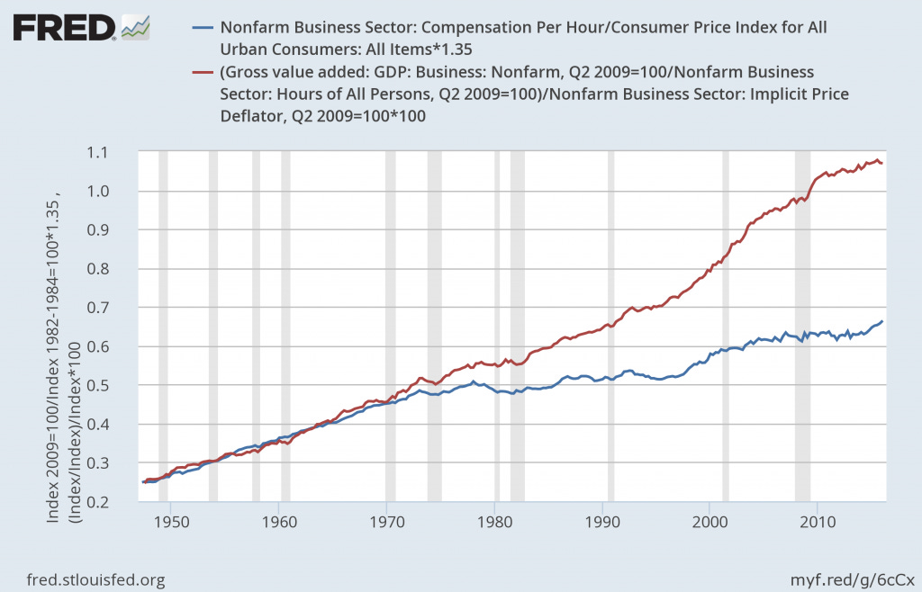
First, I wanted to make sure I could recreate the gap on my own. I used FRED to plot real compensation per hour against real gross value added divided by total hours (to proxy for productivity). I’m not sure if these are exactly the series used by EPI above, but the pictures look pretty close.
compensation_productivity_gap

Notice, however, that in order to get these data into real values, I deflated by two different price indexes – CPI for compensation and an implicit price deflator for productivity (if you aren’t sure what the difference is, here’s the BLS explanation). FRED also provides real values for each of these variables and they also use different inflation measures for each. I assume other people that have made this graph have done the same. Although it might make sense to deflate these series using different measures of inflation in some situations, it does not allow for an easy direct comparison between them. Looking at the difference between the two measures over time reveals a familiar looking gap.
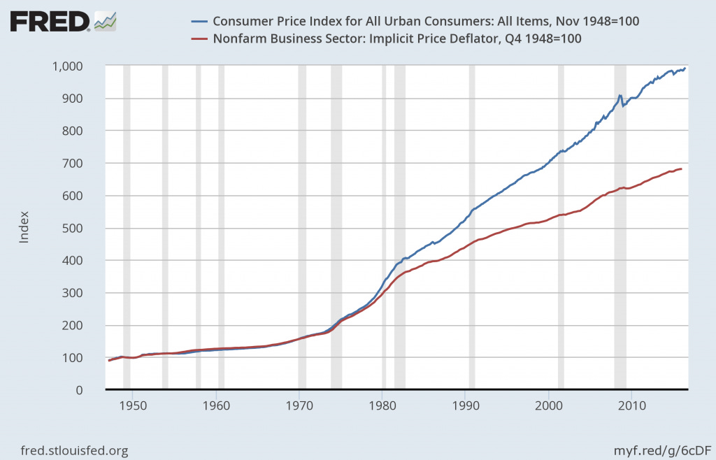
inflation_gap

So what happens if instead of trying to look at real values using different (and imperfect) measures of inflation, we just put everything in nominal terms? Bye-bye productivity gap:
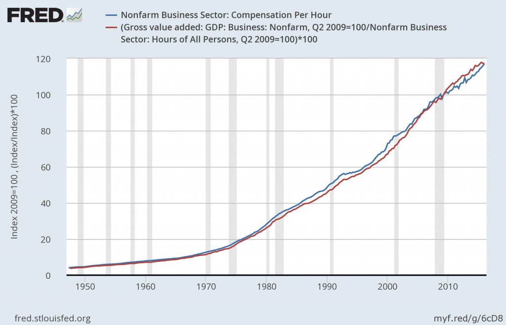
compensation_productivity_gap_2

Now, maybe there’s still something to be concerned about here. The CPI is supposed to measure the goods actually purchased by consumers. If the prices of these goods are growing faster than average, then the value of a worker’s compensation is lower. I’m not sure I have enough faith in either measure to even grant that point, but at the very least can we start calling it an inflation gap rather than a productivity gap?

5 thoughts on “About that Productivity Gap”

  1. Do you have any insight into what happened with price indices? Why they started to diverge? Could it be some kind of change in meausrement methodology? Although, my chief suspect would be trade expansion.

    On the gap itself – if I understand correctly, in simple competitive model from micro nominal productivity equals nominal wage, what we see. So what we have is some kind of inflationary phenomenon. Why should the same hold in real terms with different price indices? And why current is “bad”? What if the inflation gap was reversed – would that be good?

    1. I don’t have a great explanation for the gap. I didn’t see anything about changes in measurement methodology, but I also didn’t look that hard. I agree that it seems to correspond to increases in trade, but I would need to think a bit harder about how that would affect things.

      I also agree that we can’t really say if the gap is good or bad. That was my main motivation for writing this post. If workers aren’t being paid their productivity, that seems like it’s probably a bad thing. If it’s a story about relative price changes, it’s not so clear.

  2. On the price index divergence:

    1. If you replace the CPI with the PCE deflator, the gap with the nonfarm business sector deflator shrinks, even though both the CPI and the PCE deflator are intended to measure consumer prices.

    This is due to a number of well-known methodological differences between the CPI and PCE: the latter is chained while the former is not, the latter has different (and arguably more realistic) weights, etc. (You can see a reconciliation of the two for the last 15 years in NIPA underlying detail table 9.1U.)

    Since the PCE and nonfarm business sector deflators are both constructed as part of the national accounts, they are much more consistent with each other than they are with the CPI, and are much better suited to comparisons with each other.

    2. The behavior of the PCE deflator actually is pretty similar to the GDP deflator, so that for the economy as a whole there isn’t a big “consumption vs. production” price index gap. This is because various relative price trends in the non-PCE components of GDP – investment, net exports, and government spending – roughly cancel out.

    3. The nonfarm business sector has seen less inflation than GDP as a whole, though, essentially because all the other sectors have rising relative prices. (Other than farms, which are tiny, the other sectors are government, nonprofit institutions, and households. Government and nonprofit institutions have their output valued at cost and thus mechanically have zero productivity growth and high relative price inflation. The main output of the household sector is imputed rents for owner-occupiers, and these have increased relative to other prices as well. Take a look at NIPA Table 1.3.4 for all the numbers.)

    Generally I don’t think there are many lessons to draw from the divergence of the GDP deflator and the NFB deflator – especially since most of the divergence comes from the fact that we value government and nonprofit output at cost, which is really an artifact of measurement more than anything else.

    I think that the EPI has started to recognize this in their reports on the “productivity-pay gap”, and puts out figures for the total economy rather than the nonfarm business sector. They still twist the data in other ways, though.

    4. At the end of the day, once one uses the same price indices, changes in the compensation/productivity ratio are just changes in the labor share. The labor share has declined (though this depends a great deal on how you measure it and who you ask), but it’s declined by only a small fraction of the huge drops in compensation/productivity that these charts ask us to swallow.

    1. Thanks for the very good comments. That the gap shrinks when using the PCE instead of CPI definitely seems to confirm that this is more of a measurement story than anything to truly be concerned about.

      I hadn’t thought too much about how government and nonprofits would affect the total economy numbers vs nonfarm business, but that’s a good point too.

      And point 4 is exactly right. I should have mentioned that in the post.

Leave a Reply

Your email address will not be published. Required fields are marked *

This site uses Akismet to reduce spam. Learn how your comment data is processed.